Our UX strategy is a plan on keeping our user's experience with the product in line with the overall business goals and objectives of the company.
Who are the UX team?Our UX vision
Our UX goals
The three layers of UX
Who are the product design team?

We design products that are not only visually appealing but also accessible and functional. With backgrounds in art, creativity, psychology, and coding, we have the perfect mix of skills to create outstanding products.
Creating intuitive and user-friendly experiences involves an understanding of the user’s needs and pain-points. We translate this understanding into tangible deliverables such as wireframes, prototypes, and refined designs that are thoroughly tested and improved with user feedback. To guarantee that our designs are aligned with business goals, we work closely with Product Owners, Customer Service, and Development.
We care deeply about what we put out in the world, strive for ethical design, and create experiences that help our clients solve problems that offer something better they might not expect. We use the most relevant tools, embrace ambiguity and are always informed by user research and jobs to be done before starting a design project.
Our UX philosophy
We know that the compliance world can be a complex and difficult one. At C&R, we want to build attractive, responsive and useful compliance products by
- Making the complex compliance world more manageable
- Providing a safe and fast platform for compliance teams to collaborate
- Offering a satisfying experience and meeting the needs of compliance users by anticipating their expectations and adapting to their workflow
Our UX goals
Design for clarity
Compliance is a complex world. Complexity can turn a great experience into a bad one. We strive to present the content in an easily digestible manner. Actions should be easy to perform. We want to design an experience that shows the full picture, from Regulations and Standards to Requirements to Evidence and how they interlink to create the big picture e.g. Product Specs.
Design for efficiency
Efficiency is another key element in C2P. The easier it is to get the job done the better. If work can be batched or repeated with ease, the better.
Design for relevance
The users come first, and so do their preferences. Giving the user more relevant information and content is key to making or breaking the experience. We must look for strategies and tool to help them deal with the avalanche in everything we create.
Design for performance
Most products are judged by the speed at which it operates. People like to think that this is an engineering issue and while that may be true to some extent, it highly affects the user experience which makes it your one of your highest priorities. We want to make C2P as fast to use as possible.
Design for consistency
We will aim for consistency across the experience, using familiar concepts and interface elements. Consistency builds trust in the user. Align with their mental model, build for their context and always keep them informed of what is happening. This does not mean that we never innovate or break free of our patterns. It means that whatever we build, aligns with our core brand and helps build trust.
Design for everyone
We should design features and a product that serves and focuses on most of our users, the >80%. We are not designing for the super user but only when we have met the jobs for the general user. This also ties into accessibility. Instead of just designing a solution, have an open and honest discussion on what your goals are for accessibility.
How we achieve this
The three layers of UX

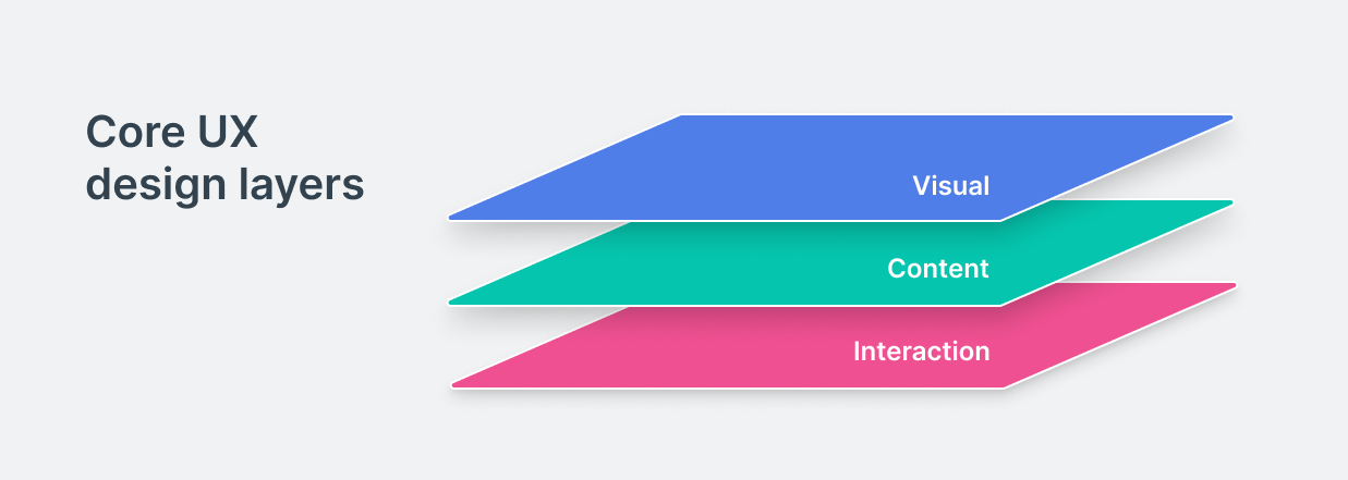
At the highest level, user experience comprises three distinct elements; visual, content and interaction. These must all operate in tandem to create a usable and satisfying experience for the user. In everything we design, we must pay attention to how these function together.
1. Visual design
People assume the visual layer, what things look like is what user experience. This is just one element of three main layers. The look is important, colours, layout and imagery all play their part to the overall experience.
2. Content design
UX writing is the next important layer. Words play a crucial role when creating a user experience. Microcopy is the small text you find on websites and apps such as button text, section captions, page titles, form labels and error messages. Small words have a big impact, visually and psychologically, but this separation of words and image in our visual mind is an easy trap for designers to fall into.
I like to think of microcopy and textual content as another design element that can make or break a user experience. Good microcopy helps the user navigate their way through a digital experience, maximising meaning in a condensed manner, and with space at a premium, every word should count.
3. Interaction design
How a button interacts with you when you hover over it or press it is not merely visual design, it's a way for the application to communicate with you. It communicates the intent, attracts your attention, and guides the user through the visual layer.