Accessibility
Contrast
If there is sufficient contrast between foreground and background colours, particularly between text and its background but also applicable to the keys of graphs and similar, then users with moderately low vision or with colour deficiencies that affect contrast to a minor degree are more likely to be able to access our content without requiring additional assistive technologies.
Colour contrast
This is a ratio of 4.5:1 for text 18pt or less in size, and 3:1 for text larger than 18pt or text that is bold and larger than 14pt.
All colour combinations must pass the WCAG 2.0 AA-compliant colour contrast check. Use the Snook colour contrast checker.
Click and touch target area
Click and touch targets must be large enough to touch accurately.
For pointer devices
Recommended click area should be a minimum of 42px square. On any clickable elements, such as Icons, buttons and links.
For icons that are 16px to 32px in size, we can do this by creating an opaque mask that is 42px and overlaying it.
Icons should be spaced at least 16px apart.
For touch devices
All users benefit from larger touch targets. For young users, and users with motor and/or vision impairments, this is even more important as accuracy can be difficult.
Content touch targets must be large enough to read and have a large enough interactive target area to tap comfortably with one finger.
The recommended size of touch targets is 7 – 10mm. This size is equivalent to the smallest average finger. An interactive target area should be at least 7 x 7 mm.
If not, it must be no smaller than 5 x 5 mm inside an exclusion zone of at least 7 x 7 mm that does not overlap with any other touch target. The recommendation is to provide a bigger touch target where possible.
Sometimes text that is big enough to read is too small to touch. For example, a linked letter in an A-Z listing would be too fine to touch accurately and should be placed in a linked container to increase the target area.
Hover states and hidden information
On desktop, hover states are ubiquitous, but as we use these across the app, we need to keep in mind that they do not work on tablets. This can be disastrous for awesome users.
Hints, titles and other tooltip-like text should provide additional explanatory content rather than repeat the main alternative for an element, object, or image. This prevents duplication of information for screen reader users.
Minimum text size
- All content must have a minimum size of 12px
- All core content must have a minimum size of 14px
Toaster notifications
The toaster notification is creating a lot of noise when user input fields are saved multiple times.
When the notification duplicates, rather than bringing clarity, there is too much visual noise. This will lead to notification blindness and these being ignored.
What not to notify on
Interactions that involve multi-selections such as checkboxes, field input and editing fields (these have inbuilt feedback).
Examples are:
- Linking requirements and regulations from the panel
- Editing multiple inline fields on the evidence panel
- Adding tags on scopes and summary
What to notify on
One time actions
- Saving
- Exporting (Generating message)
- Deletion
- Sharing
- Adding
- Converting
- Cloning
Emails are an important part of the User Experience. We must ensure all email alerts and notifications have consistent branding and visual elements.
Customers need to
- Tell that the email is from C2P: The subject is the most important part of the email.
- Tell if it is real: It must look trustworthy. The ‘From’ email address must be clearly from C2P.
- Know why they are receiving an email. This should be part of the subject e.g. ‘Task: You have been assigned a task’.
- Know what to do next: This will be contained in the body of an email. It must be broken up into clearly defined sections.
Animation and transitions
Duration and easing
A rigidly linear movement looks unnatural to the human eye. We are born into the nonlinear physics of motion in the world. Accelerate and decelerate smoothly to help your animation feel more natural.
Duration
All durations should feel as quick as possible without being instantaneous and responsive.
Elements entering the screen need a longer duration than objects exiting. This is to make them feel snappier, as when the action has been done by the user, dismissing or closing something should feel more instantaneous. Example: A side panel can take 350ms to appear, but only 200 disappear.
Animations timings
- 150-200ms (small transition areas: buttons, toggles, inputs)
- 250ms (medium transition areas: Cards, facets expand/collapse, linking)
- 350ms (large transition areas: Panels, overlays, page refreshes)
Easing
Standard: cubic-bezier(.07,.95,0,1)
Use this curve for the majority of animations. Accelerate at the beginning of the animation and slowly decelerate by the end.
Types of animation we use (in progress)
https://codepen.io/mzuro/pen/MWaYgBq
Slide in/out from side
- Preview panels
- Create panels
- Edit panels
- Hide/show activity and task panel
- Activity items
- Facet filter
Specs to follow
Slide in down/up
- Task item
- Saved search item
Specs to follow
Slide in left with bounce
- Relevance controls
- Edit tags
Specs to follow
Fade in/slide down
Icons
How do we choose an icon
We have a library of bespoke icons that cover most actions and labels in the system. The majority are familiar icons like Print, Download, Adding etc.
A small minority of icons need to refer to more abstract concepts such as regulations, standards, requirements and these have been created especially. There will be a need to create more, so to understand how to begin creating an icon, we can use semiotics to describe what an icon is.
Icon
Physical resemblance to the signified. Resembles whatever it depicts.
Index
Evidence of what’s being represented. Smoke to indicate fire.
Symbol
No resemblance between the signifier and the signified. Must be culturally learned. Numbers and alphabets.
Rule when creating an icon
- Use ‘Icon’ when creating an icon
- If the concept is abstract, use ‘Symbol’ but must be paired with a label
Optical alignment
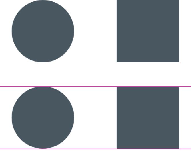
What is bigger, the circle or the square?
Both shapes are the same dimensions
Geometrically speaking, their width and height are equal. But look at the picture below. Our eyes immediately detect that the square outweighs the circle.

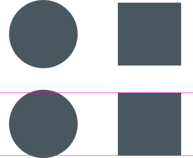
The circle is bigger than the square
They now looked balanced.

Rule
Make round elements slightly bigger than square objects to maintain balance.
![]()
Dimensions and style
The choice of style for our icons is based on two considerations
- Text density
- Base size
Text density
Our system is data heavy. Most pages have a densely packed layout with content and lists. To create an icon system it is important that they do not compete with the text but partner with it. So having strong stroke but keeping them light by not using a heavy fill. They are outlined in style but not thin to hold their own against the dense text.
Size
The base size for our icons is 16px, though they can be enlarged to 24px and rarely to 32px. They can also be decreased to 14px to fit comfortably in buttons and with labels. As there is a lot of content on the pages, 16xp pair perfectly with our body text size and line heights.
![]()
![]()
Rule
- Icons should be created on a 16px grid
- Stroke size is 2px
- If icon is square or has straight edges, make icon 1px smaller than 16px boundary (optical alignment)
Slideouts and modals
Use of Slideout panels
Slideout panels should be used for actions related to the user’s primary path. These panels allow for greater content and/or more complex interactions thus behaving much like an additional page while maintaining a contextual connection to the primary task.
Use of Modals
Modal windows are best used to focus attention either on some particular content (such as a video), or to confirm an action or decision (such as “Do you wish to delete the selected files”). Typically modals should be used when the information presented is more concise and the interactions are less complex (than that used in slideouts).
Responsive breakpoints
- 1342px – below this point we show collapsed left panel
- 800px – below this point we show mobile styling