Small words have a big impact, visually and psychologically, but this separation of words and image in our visual mind is an easy trap for designers to fall into.
What is microcopy?Activity and metadata
Adding and new actions
Alerts, warnings, and messages
Buttons
Dates
Delete messaging and dialogs
Forms and inputs
Showing more or less content
Tables
Titles, labels and when to capitalise
Titles, labels and when to use singular or plural
Tooltips
User selection
What is microcopy?
Microcopy is the small text you find on websites and apps such as button text, section captions, page titles, form labels, and error messages. Think of microcopy and textual content as another design element that can make or break the user's experience.
Good microcopy helps the user navigate their way through a digital experience, maximising meaning in a condensed manner, and with space at a premium, every word should count. You can read more on the subject on Microcopy: an essential guide to becoming a more literate designer.
Activity and metadata
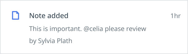
What happened is the most important part of an activity stream so, we can format text in the following manner.
Anatomy of activity
- Leading icon
- What happened
- Detail of what happened (Optional)
- Who did it
- When
Example
Time format
The time since an activity was last performed is initially displayed as a time format, such as '1h' '2d' or '1w'. If the activity occurred more than a week ago, the time since the activity occurred will be displayed as a date format, such as 'April 14'.
Icon
The leading icon will be relevant to each type of activity item.
Adding and new actions
Users make new things in C2P such as requirements, evidence, tasks and so on. They also add existing things such as regulations and requirements. So what should we ask them to do? To the user, they are simply 'adding' something to the platform, whether it is existing or completely new.
Example
For adding existing and new things
Use 'Add' as the label on a button.For messaging and notifications
Use 'added' as in 'This regulation has been added', whether new or existing.If there are two options
Use 'Add' as the main button label. Example is 'New' and 'Link existing' in a popover,Do not use 'created'.
Alerts, warnings, and messages
In general these messages need to be processed quickly by the user. Keep messages short and simple.
Avoid unnecessary punctuation. Read more in writing style
Avoid words that don't contribute to the meaning. For example, 'No results found' instead of 'We're sorry, but the search returned no results'.
Passive voice
If you expect the user to know who caused the action, passive voice is best.
Example
- 'Record changed' is better than 'You have changed the record'.
- 'No results found' is better than 'The search did not find any results.'
In most messages, either the user or the platform causes the action, and so use passive voice is the best approach.
Active voice
If the user does not know who caused the action, the active voice might be preferable.
Example
'Another user changed this record. Reload to see changes' is more informative in this context than 'Record changed. Reload to see changes'.
Be constructive
Constructive formulations suggest useful follow-up actions, instead of simply presenting a statement. Be precise about any action that must be taken.
Where possible, use constructive formulations:
No, but…
Example
(No) You cannot view this task because you are not assigned. (But) Please request access.'
Yes, and…
Example
(Yes) You have been subscribed. (And) View now.
Buttons
- Where possible, clearly show the action that will happen when the button is clicked. See grammar of interactivity
- Begin the label with a verb that describes the action. For example, 'Add', 'Save', or 'Search'.
- Use sentence case. See Titles, labels and when to capitalise. For example, 'Add new', or 'Link to master requirement'.
- If part of the label is a proper noun, capitalise as appropriate. For example, 'Display all Canadian regulations'.
- Do not end a label with a full stop.
- Label buttons consistently.
- For example, buttons in a toolbar should not mix plural/singular. For example, 'Tags', 'Links', and 'Product'. They should all be plural 'Tags', 'Links', and 'Products'.
Dates
If the date is inside a piece of text, spell out the month (for example, June 25, 2018). This is the most human-readable format and avoids international misinterpretation.
Example of our format
Our format is US. Month first i.e. Feb 12, 2020.
In all places such as lists, published metadata our format is Feb 12, 2020, putting a comma between day and year.
Dates should always show year, except:- In lists sorted in Chronological order, the date should not show year if this year
- 'This year' refers to calendar year and not 'today minus 365 days'
- Evidence expiry date should always show year
- Legal deadlines should always show year
- Author dates - always show year
- Relevance note - always show year
- Created by David Hall on Feb 14, 2019
- Updated by Robert Frost on Apr 25, 2020
- Dates added as a 'data input' field (by GRCT or Customer) should always include a year (even task deadlines, because these could extend more than a year into the future).
- C&R operational dates—created/updated/alerted, when they appear on lists as a sort field and are sorted can appear without the year if the date is of the current year. This is because—because they are limited by 'Now' and do not project into the future.
Delete messaging
When presenting the user with the option of deleting an item, the text should be descriptive and to the point. Do not use too many words.
Anatomy of a dialogue message
- Title: Present the name of the action in the header.
- Body: Explain what is happening and the outcome of the action. This is in the form of a question.
- Button: Restate the action in the confirmation button
Example
Title: Delete search
Body: Are you sure you want to delete this search? You cannot undo this action.
Button: [Cancel] [Delete]
NOTE: Cancel button is always to the left of the action button.
Showing more or less content
- Use sentence case in the label. See Titles, labels and when to capitalise.
- As a rule of thumb: the generic 'Show more' and 'Show less' work fine.
- If you specify the thing that is being shown, be careful about subject-verb agreement.
Example
For example, 'Show less dates' is grammatically incorrect. 'Dates' is plural, so 'Show fewer dates' is correct in this case. However, 'information' is singular, so 'Show less information' is correct.
Forms and inputs
General rules
- Use sentence case for field labels and field hints. See Titles, labels and when to capitalise.
- Avoid punctuation in field labels.
- Do not end a field hint with a full stop or ellipsis (…).
Required fields
Do not mark fields as required, as these are in the majority. Mark optional fields with (Optional).
Example
Description (Optional)
Tables
Alignment in columns
Text → Left align
This includes titles, text paragraphs, dates, tags. This makes it easier to read the contents of the cells.
Numbers → Right align
This makes it easier to compare the values and spot patterns.It also helps to make sure that the decimal points are lined up, making it easier to compare decimal values.
Actions and icons → Center align
This includes checkboxes, radio buttons, buttons and images.
Multi-part values → Align by separator
This will be less common but align by a common separator such as 1024 x 768 or Apple = Fruit.

Titles, labels and when to capitalise
There are two commonly used cases: title case and sentence case. We use sentence case for everything with a few exceptions. Title case is only used for proper nouns such as Evil Corp and Valley Cryogenics or branded terms in our own platform such as Product Compliance.
The reason for using sentence case are; it is more conversational, sounds less formal, easier to read than title case and an easier rule to remember. 🙂
Use sentence case
Sentence case is when you only capitalise the first letter of the first word in a title. Use sentence case for all titles, such as page titles, headings.
Example of sentence case
- Requirements list
- Report dashboard
- Add task
- User profile
When to use title case (capitalisation)
Use title case only for proper nouns such as top navigational items, or branded terms. Top navigational items are capitalised because these terms are unique to us.
Example of sentence case
- Product Compliance
- Assessment Report
- Alert Home
How to spot proper nouns
There are two types of noun, common and proper.
Common nouns are nouns that refer to a class, or group, of the same type of people, animals, places, things, and ideas. These should not be capitalised.
Example: 'requirement', 'regulations'.
Proper nouns are nouns that name specific, one-of-a-kind people, animals, places, things, and ideas. Proper nouns must start with a capital letter.
Example: 'Product Compliance', 'Alerts Home', is one of a kind and unique to us.
Note: Sometimes sentence case can lead to an odd-looking title such as 'UI guidelines'. The two uppercase letters 'UI' followed by the awkward descending 'g' leads to an inelegant title. We can use our judgement and us 'UI Guidelines'.
Do not end a label with a full stop.
Titles, labels and when to use singular or plural
The general rule for C2P is to use plural nouns for titles and labels that represent a category or concept as we allow choosing multiple options on most categories in C2P.
For facets, filtering and select inputs
For filters, facets, and select inputs where users can choose multiple options, use the plural form. This clearly indicates that multiple selections are possible.
Example for facet title
Geographies: (Filter title)
- European Union
- North America
- Asia
For navigation items such as top nav and side nav
For navigation items like top and side navigation, the choice between singular and plural depends on whether it represents a single view or a list page.
Singular: Use singular nouns for labels that lead to a single view, like an account settings page.
Plural: Use plural nouns for labels that lead to a list of items, like a list of messages in an inbox.
Example for top nav
- Inbox (Singular as it leads to a signle list of messages)
- Dashboards (Plural as it leads to multiple dashboards)
- Requirements (Plural as it leads to a list of individual requirements)
- Profile (Singular as it's a single view)
For insights and charts
We generally use plural for chart titles. All our charts allow allows for multiple data series or selections and the ability to compare or analyze multiple aspects.
Example for charts
Plural: "Assessments", "Team tasks","Total regulations".
Tables
For table header labels, we generally follow singular mode in columns if refereing to one item of data, but plural is there are figures or multiples.
Example for top nav
Singular: "Regulation," "Task" "Status", "Product category".
Plural: "Assessment (showing counts)" "Requirements (Showing counts)".
Tooltips
- If icons do not have a label, always use a tooltip to describe the action.
- Users shouldn't have to rely on tooltips to complete their tasks. Instead, tooltips are best used to provide additional information or context for form fields or requests that might be confusing to some users.
- Use sentence case. See Titles, labels and when to capitalise.
- If the tooltip contains only one sentence, do not end with a full stop.
- If the tooltip contains multiple sentences, end each sentence with a full stop.
User selection
When offering a choice, it's advisable to consistently use the term 'select' instead of 'choose.' For instance, in scenarios like wizards and creation screens where users need to make a decision from a wide array of options, we can use phrases such as 'Select a material topic' or 'Select your geographies.'